1. What Is Power BI?
Power BI was released to the public by Microsoft on July 24, 2015, as a Business Intelligence (BI) tool. It helps companies analyze, calculate, and visualize data, turning raw data into vivid, easy-to-understand reports and dashboards.
Instead of dense numbers and figures packed into Excel, Power BI displays reports visually, letting users easily track the metrics they care about or dig into additional key information — helping companies adjust their management strategy based on a multi-dimensional view.
Power BI particularly stands out for its ability to connect to data automatically and display reports in real time. This feature not only makes information more accurate and up to date but also helps companies make decisions faster and more precisely.
According to the Gartner Magic Quadrant report on the best analytics and data visualization tools of 2024, Microsoft's BI tool was ranked among the top BI platforms for 2024. This shows Power BI is a powerful, trustworthy tool that effectively meets user needs for data analysis and visualization.
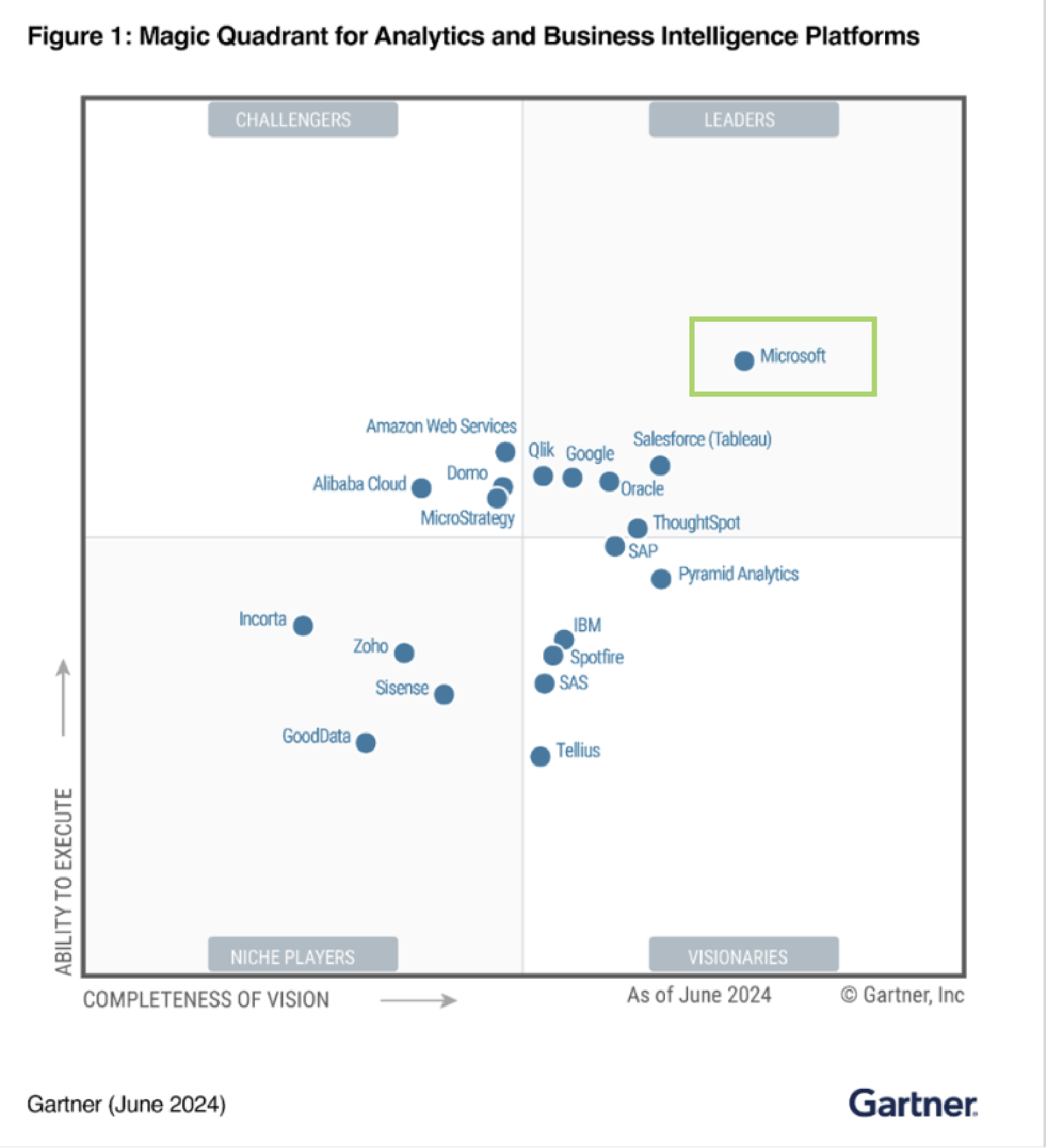 Power BI is rated by Gartner as a leader in business analytics
The main tools within Power BI include:
- Power BI Desktop: A free application for connecting to, analyzing, and visualizing data
- Power BI Service: A web-based service for hosting and sharing reports
- Power BI Mobile: A mobile app for viewing reports (compatible with Windows, iOS, and Android)
2. The Power BI Tool Ecosystem
2.1 Power BI Desktop
Power BI Desktop is software installed on a computer that lets users build reports with the full range of data analysis and processing features.
Within it, the two most important tools in Power BI Desktop are Power Query and Power Pivot, which help users shape data and model it into reports and visual charts. Specifically:
2.1.1 Power Query: A technology for connecting to and cleaning data from multiple different sources, then transforming it into the desired shape to build useful reports. The Power Query process runs: connect data from multiple sources => reshape the data => produce synchronized data tables.
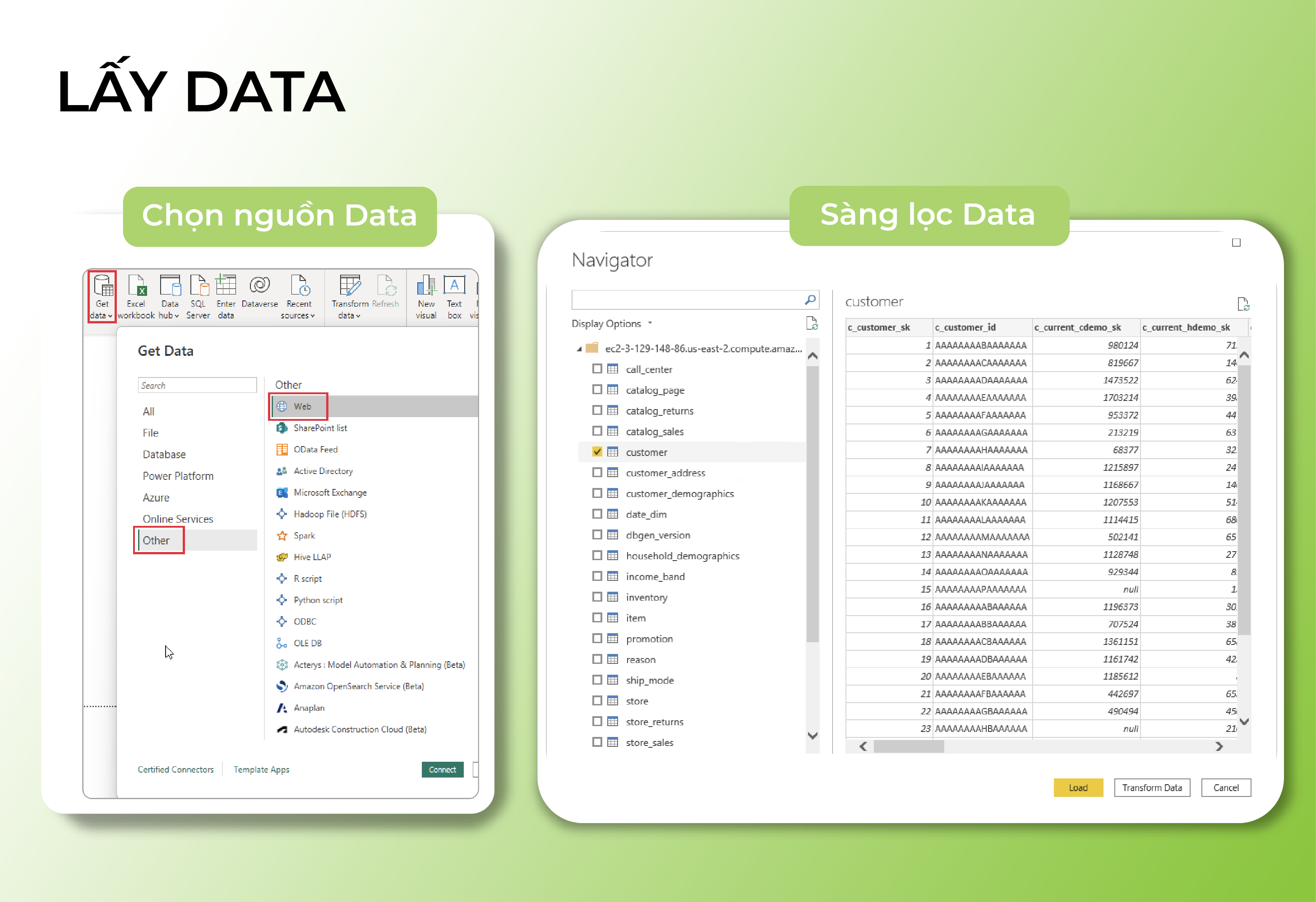 The data processing and visualization workflow through Power Query and Power Pivot
2.1.2 Power Pivot: A technology that lets users build data models, define relationships, and create calculated functions on that data model. Once data has been shaped by Power Query, Power Pivot's features let users establish relationships between separate data tables and model them into graphs and charts for multi-dimensional comparative analysis of reporting metrics.
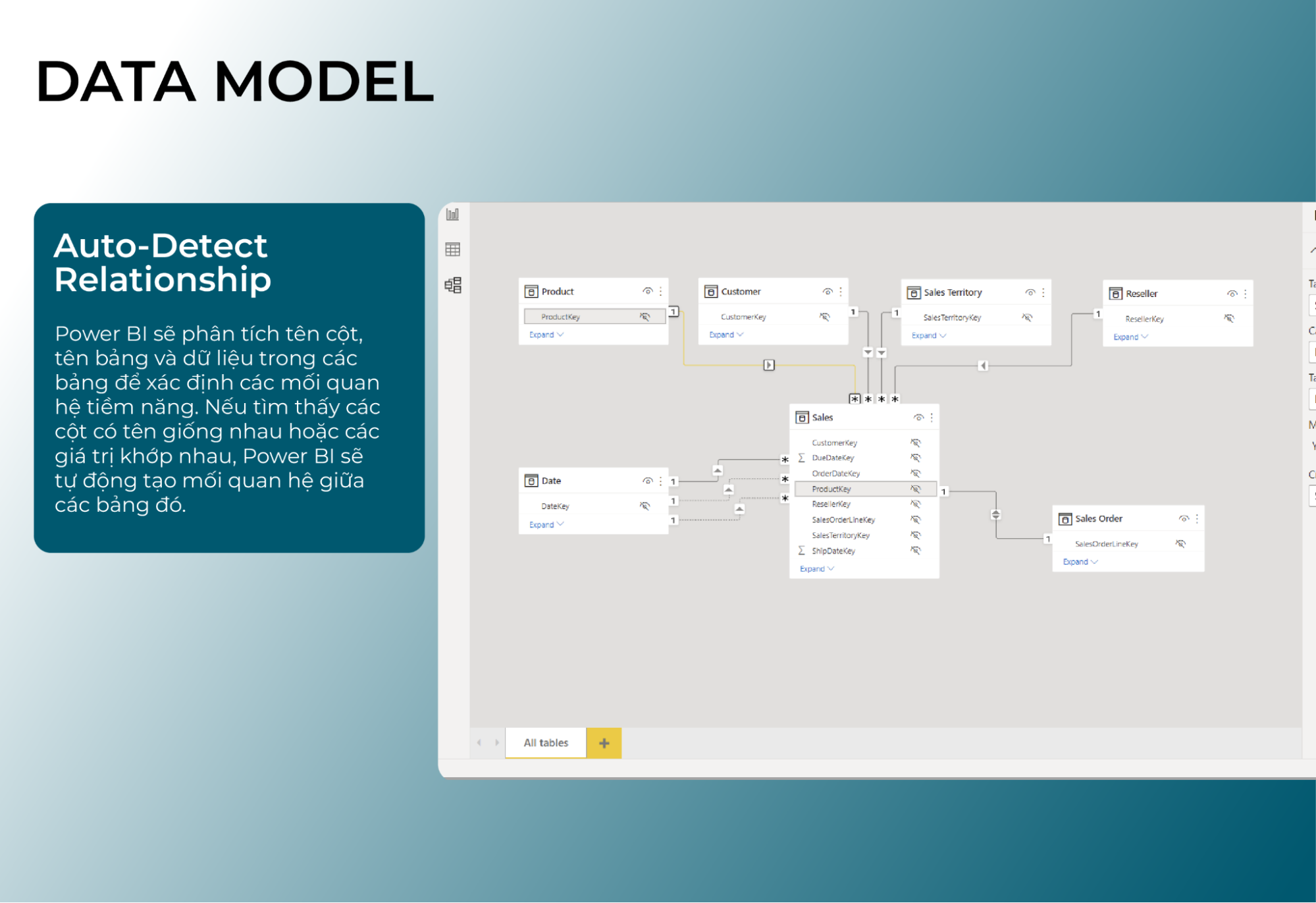 Power BI's visual data modeling feature
2.2 Power BI Cloud Service
This is a cloud-based online service Microsoft built specifically for Power BI, running as a SaaS (software-as-a-service) offering that lets users share the digital reports built in Power BI Desktop. End users on Power BI Service can view and edit reports from anywhere, on any device.
Another standout feature of Power BI Service is its continuous refresh from data sources, enabling an automated report-update process on a required schedule with no manual intervention needed.
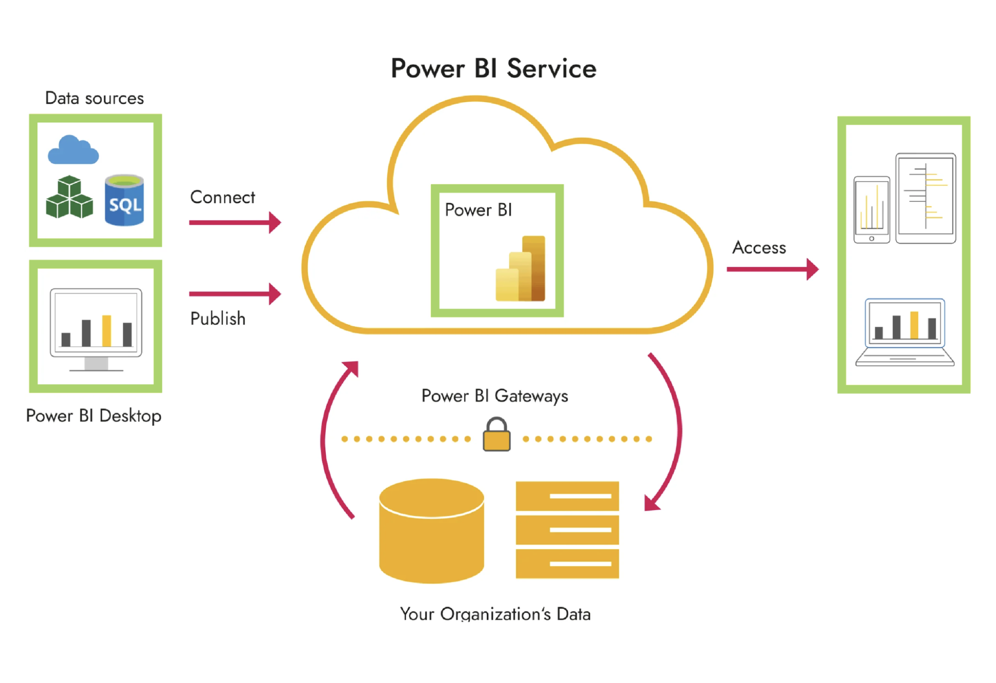 Once finished, reports are shared onto the Power BI Service platform
2.3 Power BI App Mobile
Power BI App Mobile is an app that makes it easier to view reports on phones (iOS, Android, etc.) and tablets. Reports in Power BI App Mobile can be flexibly customized, letting users view and interact with reports right on their mobile devices.
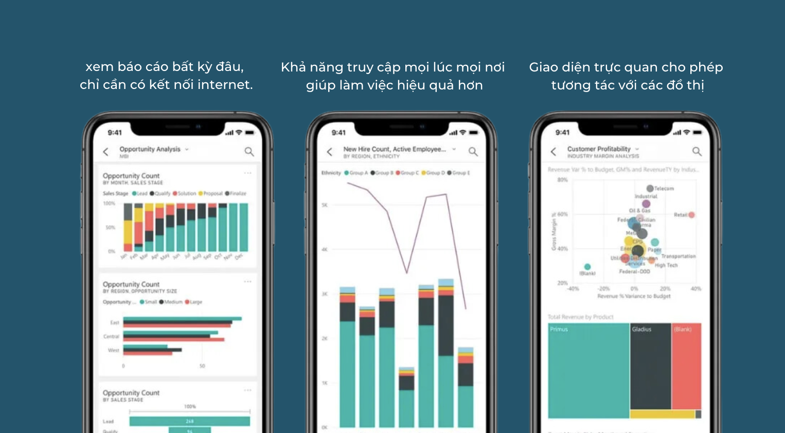 Experience Power BI anytime, anywhere with the mobile app
In addition, Power BI includes several other tools, such as Power View and Power Report Server, among others.
3. The Data Processing Workflow in Power BI
Activities and analyses in Power BI typically follow this sequence:
- Import source data into Power BI Desktop, clean and standardize it via Power Query, model the data, and build reports with Power Pivot.
-
Publish the report to Power BI Service – share dashboards with everyone involved, such as your manager, colleagues, or anyone connected to the work or project you're running.
- View and interact with reports and dashboards through the Power BI Mobile app.
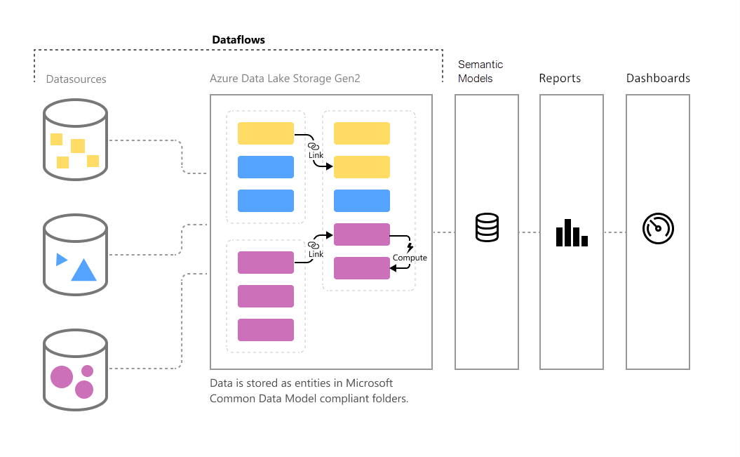 Power BI turns raw data into detailed insight in just a few simple steps
4. Standout Power BI Features That Help Companies Optimize Business Performance
4.1 Powerful Data Connectivity
Power BI can connect to more than 100 different data sources, including:
- Files: Excel, PDF, Text/CSV, text files (.txt), and more
- Databases: for large-scale data running into millions of rows, such as SQL Server, MySQL, Microsoft Access, and others
- Power Platform: data stored within Power BI itself, such as Power BI datasets and Power BI dataflows
- Cloud data: Microsoft Azure, SharePoint, OneDrive, and more
- Online services: Google Analytics, Salesforce Reports, Facebook, and more
- Other data sources: Google Sheets, the web, R scripts, Python scripts, and more
Power BI helps gather and connect data from every department and system into a single piece of software, instead of having to handle each data source separately based on its mechanism, storage location, or access method.
4.2 Easy Collaboration and Sharing on One Platform
Instead of sharing reports through time-consuming, inefficient manual methods, users can easily share reports with anyone through the cloud platform, regardless of time, device, or location.
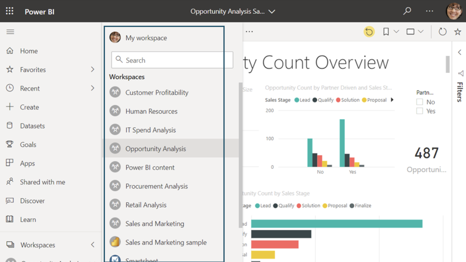 The report-sharing interface in Power BI Service
Everyone in the organization can collaborate online, track changes, or share links to the same report in real time, anytime and anywhere. The report owner can also control who can view and edit it, keeping information secure while still preserving flexibility for collaboration.
4.3 Cost Optimization
Power BI offers both free and paid tiers, including Power BI Pro and Premium. Overall, Power BI is relatively affordable compared with many other BI tools on the market, letting users tap into powerful analytics capability while keeping deployment costs down.
 Optimizing Enterprise Costs with Power BI Analysis & Effective Control
Once Power BI is applied within a company, the volume of information that previously had to be processed manually drops dramatically. That's simply because the tool now handles all the complex, resource-intensive work (time, people, cost) the company once had to shoulder itself — which in turn drives up overall operational efficiency.
4.4 Making Decisions Based on Visual Reports
Roughly 90% of the information the brain processes is visual. That's why presenting data as charts and tables both clarifies complex data and packs a huge amount of information into Power BI's visual models. This helps users better understand the correlations and relationships between the factors that matter most to a company's success, leading to more accurate decisions.
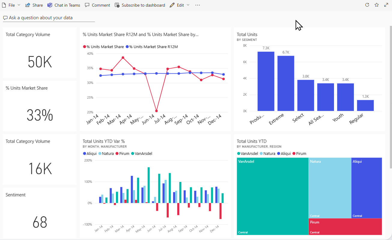 From Data to Decisions: The Role of BI in Data Visualization
4.5 Powerful Data Processing Capability
With its ability to connect to multiple data sources, users can use Power BI to build custom calculations on existing dashboards, synchronize data mechanisms, and link them together. As a result, reports across different departments remain consistent and unified.
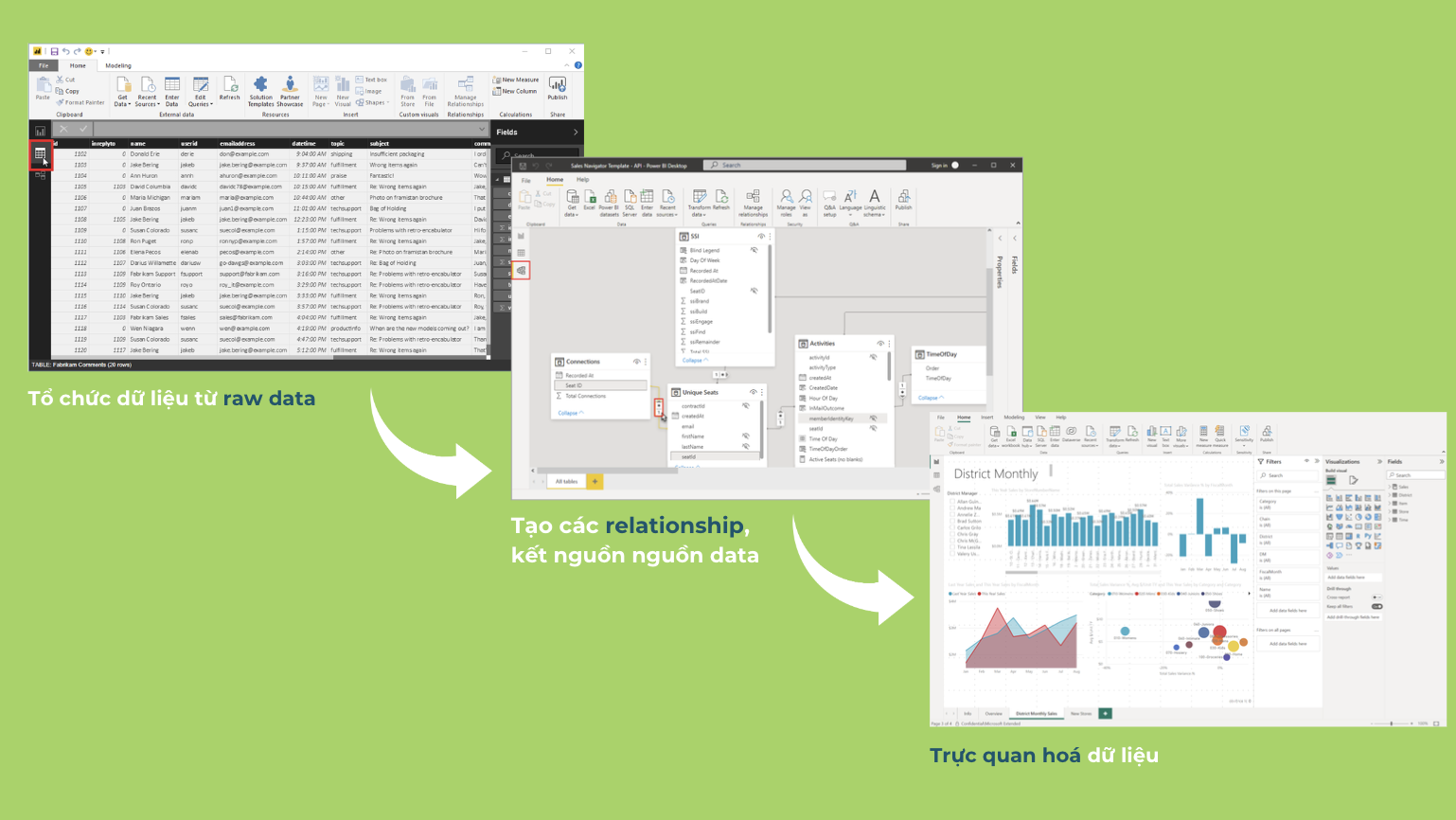 Exploring an effective data analysis workflow with Power BI: organizing, connecting, and visualizing data
Power BI comes with many built-in visualization types, such as area charts, bar and column charts, waterfall charts, funnel charts, slicers, tables, doughnut charts, KPIs, line charts, pie charts, maps, matrices, and more.
In addition, Power BI's extensibility through Custom Visuals lets users design and build their own chart types to fit their specific needs.
4.6 Professional Support and a Large Community
Microsoft provides high-quality customer support for Power BI, helping users resolve any issue quickly. Power BI also has a large user community that shares experience and solutions through forums, documentation, and online courses.
5. Some Standout Power BI Features
Power BI is deeply integrated with the Microsoft Fabric platform
Today, data analytics tools are converging onto a single platform, and Microsoft Fabric is Microsoft's answer to that shift. Fabric brings together all analytics applications, including Power BI, onto one unified platform, letting users analyze and visualize data without switching back and forth between different tools. This makes it possible to harness the full power of the Microsoft ecosystem to work with data effectively.
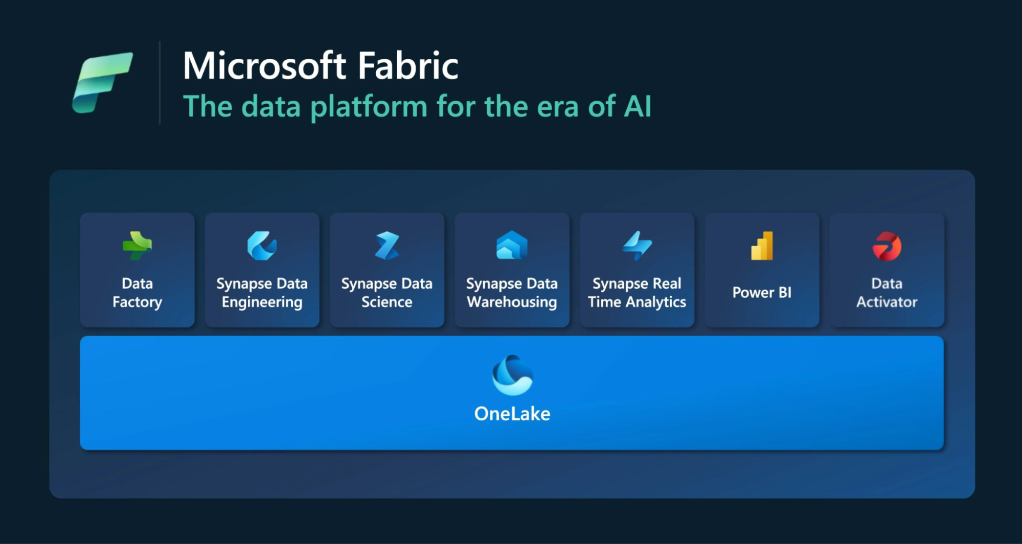 Boosting Power BI's data analysis performance with Microsoft Fabric
Simplifying Power BI with Copilot AI
Copilot AI is an intelligent assistant built into Microsoft's products to help users work faster and more efficiently through natural language processing, carrying out tasks or generating content on request.
In Power BI, for example, you simply describe the chart or report you want, and Copilot generates it automatically. You can also easily edit reports, create calculation formulas, write summaries, and ask questions about your data — all within seconds.
Delivering Powerful Data Analysis with DAX
DAX (Data Analysis Expressions) is a collection of functions, expressions, and constants used to generate new information from existing data through calculation. Put simply, DAX can be thought of as similar to a formula language in Excel — but while Excel uses simple calculation functions, DAX is built for more complex, multi-dimensional calculations that dig deeper into the data.
| |
Excel Functions |
DAX Functions |
| Purpose |
Used mainly for basic calculations and aggregating data within an Excel spreadsheet. |
Used to calculate and create new tables, columns, and measures to support data analysis and build data models and reports in Power BI. |
| Processing Scope |
Calculates on individual cells, rows, or columns within the spreadsheet. |
DAX functions operate on entire tables and columns. |
| Data Type |
A single column can hold multiple different data types. |
A column can only store one data type. If multiple data types are present, DAX selects the most suitable format and converts everything to match it. |
6. Comparing Today's Two Most Popular BI Tools: Power BI and Tableau
According to Gartner's review ratings, both Power BI and Tableau are rated 4.4 out of 5 stars by users, showing that both tools deliver comparable features and user experience in day-to-day work.
Both are BI tools, and Power BI and Tableau share broadly similar data processing and visualization workflows. However, Power BI is a Microsoft platform while Tableau belongs to Salesforce, so each tool integrates technologies specific to its own vendor, such as:
6.1 User Interface
Power BI is built by Microsoft using the same design language as the Office suite, already familiar to most users, with simple, intuitive drag-and-drop actions. It also integrates easily with other products in the Microsoft ecosystem.
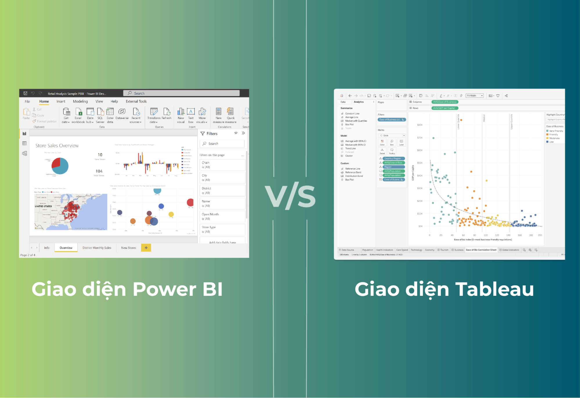 Comparing the Power BI and Tableau interfaces: which is the right choice?
Tableau, by contrast, has a more complex interface than Power BI because it offers deeper customization, but its interface remains intuitive, with drag-and-drop features that let users build charts and tables quickly.
6.2 Cost
While features are a company's top priority when choosing a BI tool, budget is also a factor that must be considered.
Power BI Desktop is completely free, offering the full set of data connection, analysis, and visualization features. Power BI Pro costs around USD 10 per user, per month, and Power BI Premium, aimed at enterprises, offers more advanced features.
Tableau's paid tier costs around USD 70 per user, per month, and enterprise packages can cost even more. Tableau's free version is also more limited in features compared with Power BI Desktop.
6.3 User Accessibility
Power BI is seen as a beginner- and non-expert-friendly tool because it's easier to learn and use, especially for users already familiar with other Microsoft products.
 Power BI – Access your data anytime, anywhere, on any device
Tableau requires more time to get used to, demanding specialized knowledge and a higher level of data-processing skill to unlock its full potential.
6.4 Data Visualization Capability
Power BI provides many chart and visual types, both built-in and from third-party applications, making it easy to turn data into a rich, diverse range of charts. Users can also build brand-new visuals themselves through Power BI's Custom Visuals, or using Python and R.
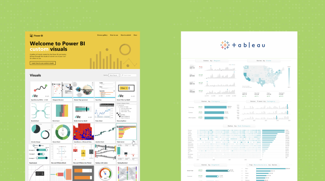 Visualizing data and making smarter decisions with Power BI
For clustering and building the best forecasting models, Tableau has the edge, with an extensive set of supporting libraries — from data processing and text analysis to statistical analysis and level-of-detail calculations — enabling fast, clean, multi-dimensional data visualization.
6.5 AI Application Capability
Both Power BI and Tableau have AI built in to support users as they work. Power BI uses Microsoft Copilot, while Tableau uses Einstein Copilot for Tableau. Both AI tools help create and customize charts and reports on request, build complex formulas with ease, and suggest questions to help explore the data.
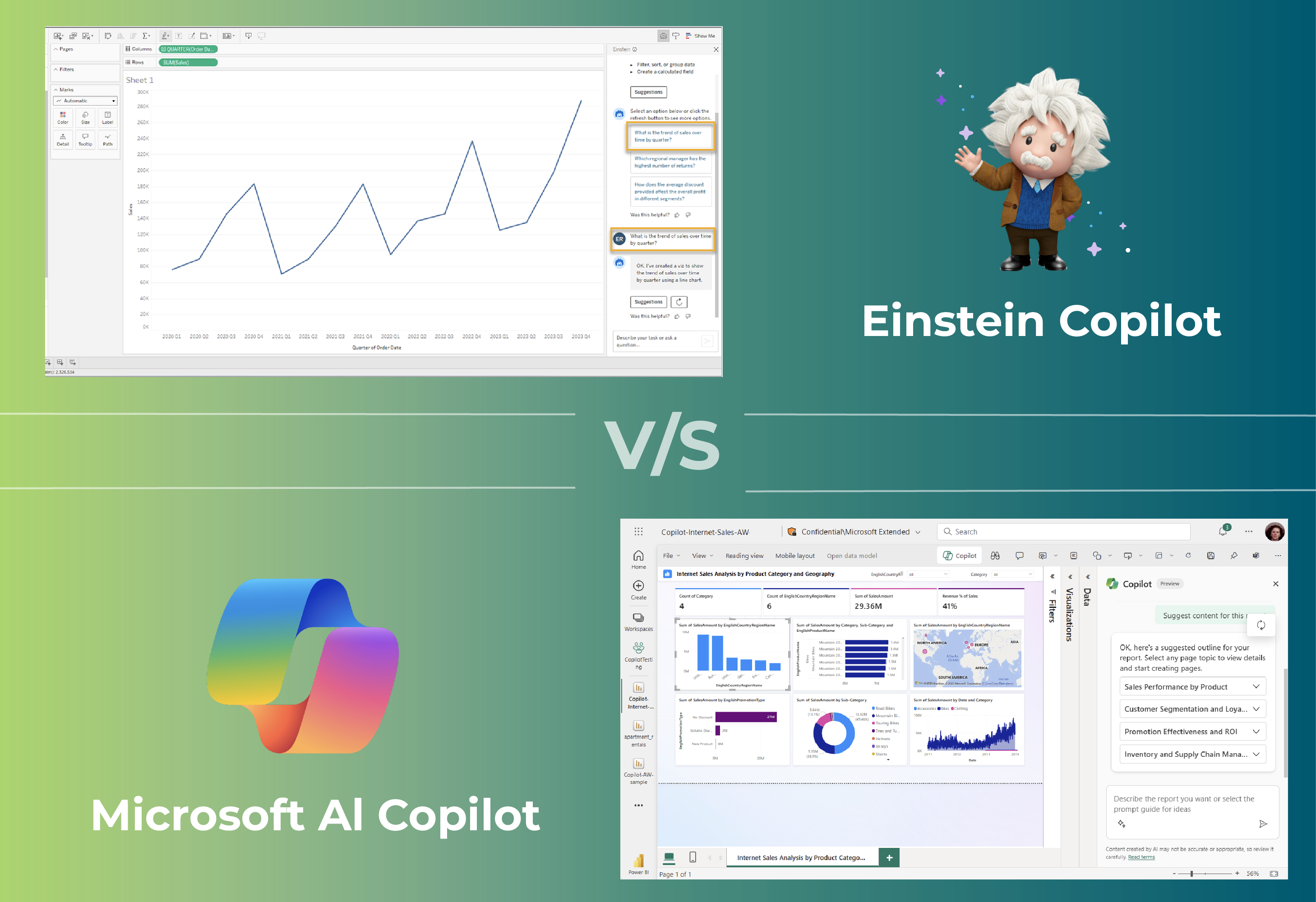 Einstein Copilot and Microsoft Copilot: Accelerating data analysis with AI
6.6 Data Connectivity
One limitation of Power BI is its data-processing capacity — performance can suffer when querying very large data sources. Because of this, the volume of input data Power BI can comfortably handle is often more limited.
Tableau, on the other hand, has excellent data-processing capability and can query data sources with millions of records. For example, given a data source with millions of rows, Tableau can render a chart showing the full one million data points, whereas Power BI may cap the display at around thirty thousand data points.
7. Citek's BI Solution Built on Power BI
Citek's BI solution, built on the Azure Data Warehouse and Power BI toolset, provides a comprehensive platform for collecting, managing, querying, and visualizing data in real time, giving companies a multi-dimensional view of their business through data. The solution package includes:
A Data Warehouse built on Azure — developed by Microsoft — capable of connecting to a wide range of other systems such as ERP, CRM, Excel, databases, and various other industry-specific applications.
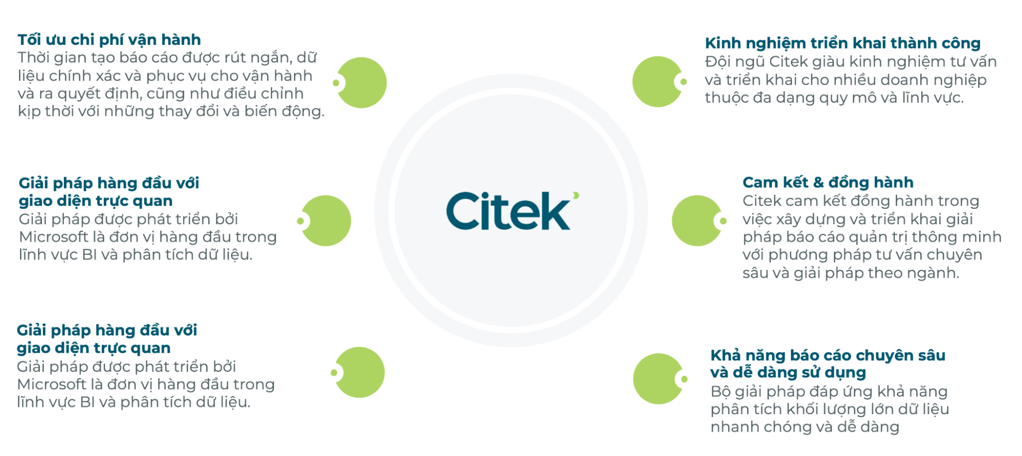 Why choose Azure Data Warehouse + Power BI, implemented by Citek
Visualization on the Power BI toolset delivers report sets distilled from Citek's experience, tailored to each industry and company type.
Citek delivers the entire Azure Data Warehouse + Power BI solution end to end — from the initial survey and data-warehouse architecture design, through build and data integration, to training users on the system.
Drawing on its track record of successfully advising companies across a wide range of sizes and industries, Citek helps companies unlock the potential of their data, shorten decision-making time, measure business performance, and surface information that's genuinely useful for the business.
8. In Closing
With its data-processing capability, visual report presentation, and ability to deliver accurate, fast, and convenient information, Power BI is a powerful tool — one that data-analytics experts and the broader user community rate highly and rely on to build a strong data culture within a company.
Deploying Power BI depends not only on cost but also on a company's specific needs and its readiness to invest in the solution. Companies should carefully weigh these factors to make the right decision, so as to strengthen data-driven decision-making and achieve strong results in their operations.
With a team of experienced experts in consulting on and implementing intelligent management reporting, Citek is ready to advise on and deliver the full Power BI solution end to end — from the initial survey through database architecture design — ensuring it meets your exact requirements and delivers clear, measurable results once successfully deployed.
